If P&C Insurance
Insurance
2014–2016
Redesigning a key digital sales journey to make multiple cover options easier to compare and choose with confidence across self-service and assisted sales.

Project snapshot
Challenge
If P&C Insurance was redesigning its online sales experience so customers and frontline teams could use the same web-based journey, with additional functionality for internal users. A design agency had created a visually polished comparison design for three cover options, but it had not been validated with users. The challenge became more complex when car insurance needed to support five cover options without overwhelming customers.
What I did
As the first UX Designer in Sweden, I tested the inherited design, identified usability issues, and led the redesign of the comparison experience across desktop and mobile. I worked closely with frontline teams, stakeholders and developers to create a clearer and more scalable comparison model.
Outcome
The redesign made complex cover comparison easier to understand, created a reusable comparison pattern for mobile across products and for desktop products with five or more covers and was rolled out first in Sweden and later across Nordic markets.
Role
UX Designer
Focus
Comparison UX, decision design, responsive design, e-commerce
Users
Customers and internal frontline teams
Team
Product owner, Business Analyst, Front-end developer, Back-end developer, Tester and cross-functional stakeholders
Impact
Created a reusable Nordic comparison model for complex insurance products
Context and opportunity
Replatforming created the opportunity for a clearer, shared sales experience online
If P&C Insurance was moving to a new system, creating an opportunity to redesign and uplift the online sales experience at the same time. A key part of that shift was bringing customers and frontline teams into the same web-based journey, with additional functionality for internal users. Previously, frontliners used a separate internal system, which made the experience less cohesive across channels.
At the same time, several products offered multiple levels of cover. Customers needed to understand what each option included, how they differed and what they would pay. That made comparison a critical part of both self-service and assisted sales.
The problem to solve
More cover options made comparison harder, not better
Before I joined, a design agency had delivered a visually polished comparison design for desktop and mobile covering three insurance options. The work had not involved users, so I began by testing the proposed designs to understand how well they supported customer decision-making.
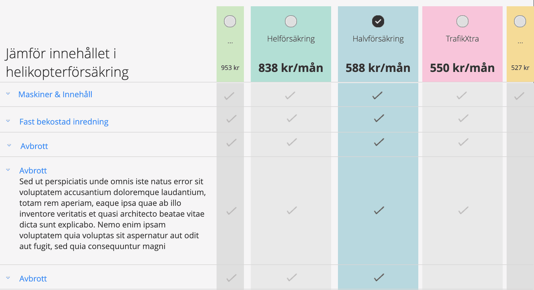
The results showed that the design worked well for three cover options on desktop, but had usability issues on mobile and did not scale well to more complex products. One of If’s key products, car insurance, offered five cover options. After challenging whether that level of choice would make comparison harder for customers, the business confirmed that all five options would remain. The challenge then shifted from reducing choice to making that level of choice easier to understand.
Inherited design


More choice without overload
Five cover options increased cognitive load, made comparison harder, and did not fit the inherited desktop design.
Included and excluded cover
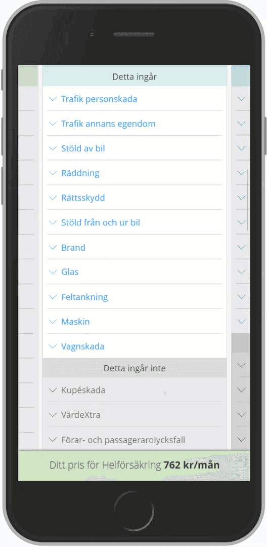
Customers needed to understand not only what was included, but also what they would miss by choosing a lower-priced option. Inherited mobile design only showed what was included.
Desktop and mobile usability
The pattern needed to support confident comparison across devices. Some mobile users missed that there were several covers to choose from.
Shared customer and frontline use
The same comparison had to work for both self-service and assisted sales.
Nordic scalability
The design needed to handle long Finnish labels without losing clarity.
My approach
I used research and iterative design to turn an approved concept into a scalable comparison model
I began by testing the proposed comparison experience to understand where it supported confident decision-making and where it broke down, especially on mobile and in products with more complex cover structures. I then used those insights to redesign the comparison pattern across desktop and mobile, balancing customer clarity, frontline usability and business constraints.
I worked closely with frontline teams, stakeholders, and developers to shape the final design direction, support rollout product by product, and share insights more broadly across the organisation through presentations and UX workshops.
This involved
Testing the proposed desktop and mobile designs
Challenging assumptions around number of cover options
Exploring new comparison patterns
Iterative prototyping and usability tests to refine the solution
Sharing insights through presentations and workshops
Supporting rollout through agile delivery
Shaping the solution
I reduced overload by focusing attention without hiding choice
Once product confirmed that five cover options would remain, I focused on making that level of choice easier to navigate. I designed the experience so users could focus on the selected cover and its closest alternatives, while still keeping the remaining options visible and comparable. I tested and iterated the design extensively to ensure it was easy to use, supported confident decision-making, and made it clear that multiple cover options were available.
This reduced overload while preserving the full comparison space and created a structure that could scale across products and Nordic markets.
Exploring the discoverability of minimised covers
I tested and iterated the design to make it clear that five cover options were available, not just the three shown in focus.


Design Decision 01
Focusing on three covers at a time reduced overload while still keeping all options visible
To avoid overwhelming users with five equally prominent choices, I designed the desktop experience so the selected cover and the two closest alternatives were shown in focus, while the remaining options stayed visible in a minimised state. This reduced cognitive load while preserving easy comparison and switching.

Design Decision 02
Keeping price visible in minimised states made comparison easier and reinforced that more options were available
Price was one of the main decision factors, so I kept it visible even when a cover was minimised. This helped users compare options more easily and made it clearer that more choices existed beyond the currently focused options.
Design Decision 03
Showing what was not included improved confidence and supported more informed decisions
Customers were not only checking what a cover included, but also what they would give up by choosing a lower-priced option. I made exclusions more visible so users could compare trade-offs more confidently.


Design Decision 04
Redesigning the mobile comparison made multiple cover options easier to discover and navigate
The inherited mobile design made it hard to notice that several cover options were available. I redesigned the mobile experience to improve discoverability and make moving between covers easier, creating a reusable pattern applied across products.

Design Decision 05
Designing for Nordic rollout meant the pattern had to handle long Finnish labels without losing clarity
Because the model would be reused across Nordic markets, the comparison needed to support long Finnish words and variable content lengths without breaking layout or comparison logic.

Final experience
The final design made comparison clearer across devices and channels
On desktop, users could focus on the most relevant cover options without losing visibility of the rest. On mobile, the redesign made multiple options easier to discover and compare. Across both, users could understand price, included cover, and excluded cover more clearly.
Because frontline teams used the same web-based journey, the redesign also improved assisted sales conversations by giving customers and frontliners a shared comparison structure.


Delivery and rollout
The pattern was rolled out product by product during replatforming
I worked closely with the business and development team to implement and release the new comparison model as products were replatformed. Caravan insurance which has two covers was the first product released in the new design in 2015, using the improved mobile pattern. Car insurance, with five covers, was released in 2016 using the enhanced desktop model.
The mobile pattern became the standard approach across products, while the desktop solution was implemented for products with five or more covers and designed to scale further if needed.
Outcome and impact
The redesign became a reusable Nordic model for comparing more complex insurance products
The final experience improved clarity around both coverage and exclusions, reduced confusion when more options were available, and gave customers stronger support for making informed decisions online. It also created a more cohesive omni-channel experience by helping frontline teams and customers work from the same comparison structure.
The pattern was implemented first in Sweden and later reused across Nordic markets. This work also contributed to my promotion to Nordic UX Lead Designer in 2016 and to receiving the If Pen Award 2016 for significantly improving the usability of If’s digital services through strong customer focus. It also contributed to the broader online sales experience later recognised as Sweden’s Best Bank & Insurance Site 2018, with praise for making it easy and safe for customers to compare and buy insurance online.
Reflection
Strong UX turned a visual concept into a better decision-making experience
What made this work valuable was not just improving the visuals, but proving what actually helped users compare, understand and choose. It also showed the value of designing for self-service and assisted sales together and of using research insights to influence both product decisions and organisational understanding of UX.
The frontliners also really appreciated being able to influence how the system they used day to day was designed and how it fitted in to their way of working.
My contribution
Validated the inherited comparison design through usability testing
Solved how five cover options could work without overwhelming users
Redesigned the mobile comparison pattern across products
Shaped a shared experience for customers and frontline teams
Worked with stakeholders and developers through rollout and replatforming
Shared research insights across teams and leadership to strengthen UX understanding